Year | Mean waiting time (weeks) | Standard deviation waiting time (weeks) |
|---|---|---|
2,020 | 13.5 | 10.2 |
2,021 | 19.1 | 15.6 |
2,022 | 20.9 | 13.9 |
2,023 | 22.8 | 14.7 |
Appendix C — Exercise 3 solutions
Question 1
The following line graphs are taken from the Criminal Courts statistics quarterly report, showing the average number of days from offense to completion for defendants at the Crown Court. Which graph is the most appropriate to display the average time and why?
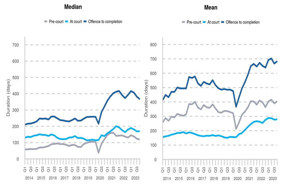
When displaying averages/measures of centre, we should only give one measure. If the data are normally distributed, the mean and median will be equal so there is no need to show both. If the data are not normal, the mean is not a valid measure and should not be shown anyway.
The median should be used as there is a substantial difference between these values, indicating that the data are not normally distributed.
When displaying graphs for comparison, ensure that the axis scales are the same to avoid misleading readers who will assume a like-for-like comparison.
Question 2
The mean and standard deviation of waiting times in weeks for hearings in the Crown Court between 2020 and 2023 are given in the table below. Using this information, what can you tell about the distribution of these times?
If we use the formula to approximate the 95% sample range, all these give negative waiting times which are impossible. For example, in 2020 the 95% range of waiting times would be approximately \(13.5 \pm (10.2 \times 2) = [-6.9, 33.9]\) weeks. Therefore, the data are not normally distributed and the mean should not be given. The median and interquartile range would be more appropriate.