Appendix B — Exercise 2 solutions
Interpret the graphs, note any trends, any surprising results, and anything you would check in the data if this was your work. Make a note of things the visualisation did well and ways in which it could be improved.
Question 1
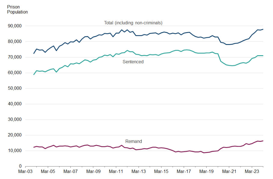
- Dip in sentencing in 2020 during the pandemic, assuming due to court closures. Increasing up to 2023, almost returned to previous levels.
- Number on remand has been increasing since around 2018/19. Look back into the data to try to understand the reasons for this. Is it possible that the steeper increase post-2020 is a result of an overloaded court system?
- Hard to see differences in remand population as it is so small compared to the other lines, would it be better to show these as separate plots to better understand the changes over time?
- Annotations to highlight the court closures and any changes in policy that could help explain patterns would be a helpful addition.
- Text should be made larger to make the graph more accessible.
Question 2
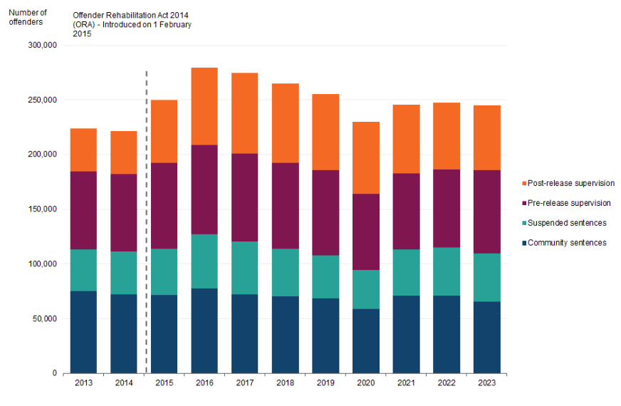
- Clear annotation helps to explain the increase in supervisions following a policy change.
- The differences in total supervisions makes it difficult to compare the number of types of supervisions over time. Has the number increased in every type following the introduction of the ORA or has this had more of an impact on post-release supervision?
- These comparisons could be made clearer by adding labels with total to the bars or could be compared using a line graph with a line per supervision type (and possibly a total line).
- A proportion stacked bar chart may also be useful to compare whether the distribution across types has changed following the change in policy.
- Text should be made larger to make the graph more accessible.
Question 3
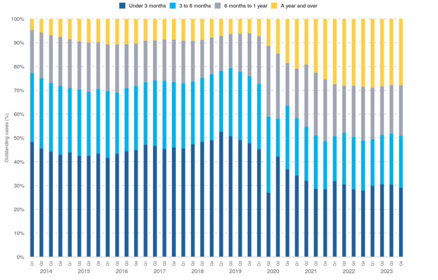
- There is a clear trend over time, with the proportion of ‘older’ cases increasing following the closure of courts in 2020.
- An annotation would help make this trend clearer and make the proportions easier to interpret. -The use of bars creates a Moire pattern, a visual trick that makes the bars look like they are moving. This is quite unpleasant for some readers (me included), making it hard to look at the plot too long and interpret it.
- Consider joining the bars into a stacked area plot to remove this unpleasant pattern.
- Text needs to be larger to make the graph more accessible.